Why Your AI Images Look Basic (And the Prompts That Fix It)
You typed something into Midjourney. It made sense in your head. You hit generate and got back something that looked like clip art from 2009.
Flat. Generic. Slightly wrong in a way you can’t even name.
Meanwhile, somebody else is over here producing images that look like they belong in a magazine editorial or a luxury brand campaign. Same tool. Totally different results.
The gap is not the software. It’s the prompt.
And the frustrating part is that nobody really teaches this. Most people just keep typing vague descriptions and hoping something good comes out. It rarely does.
Here is what is actually happening when a prompt falls flat.
AI does not think the way you do. It does not read between the lines or assume what you meant. You type “a beautiful woman portrait” and it gives you exactly that and nothing more. No depth. No mood. No direction. Just a technically correct, completely forgettable image.
The tools are capable of so much more. They just need you to act less like someone making a request and more like someone giving direction on a film set.
What Separates a Basic Prompt from One That Actually Works
Good prompts control specifics: lighting, camera angle, mood, texture, color palette, style reference, environment. You are not just describing a subject. You are building a scene.
Look at the differences here:
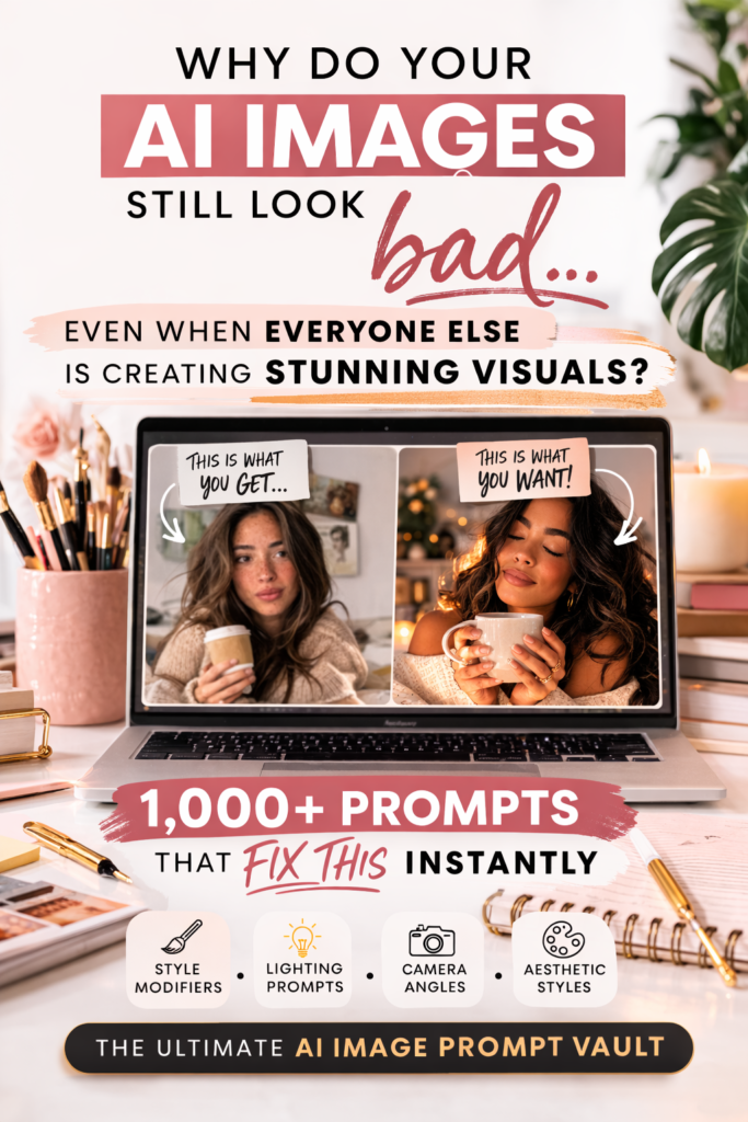
Basic: a beautiful woman portrait
Specific:close-up portrait of a brown-skinned woman with glowing skin, soft natural lighting, 85mm lens, shallow depth of field, neutral background, editorial photography style
One is a thought. The other is instruction.
Basic: a woman drinking coffee
Specific: cozy morning scene, woman in a sunlit kitchen, warm golden light coming through the window, candid moment, realistic textures, lifestyle photography
The second one feels like a real moment. Not a stock photo placeholder.
Specificity creates mood. Mood creates quality. That is the whole formula.
This works across every category. Futuristic cities. Product shots. Fantasy art. The more clearly you direct it, the better it performs.
A luxury skincare bottle photographed on marble with diffused lighting and a clean background looks like it belongs on a brand’s website. The same bottle described as “skincare product on table” looks like an afterthought.
Why Most People Stay Stuck on Mediocre
It is not that they cannot write better prompts. It is that they do not know which details actually matter. Lighting and camera angle change everything. Mood descriptors change everything. Most people skip those entirely because nobody told them they mattered.
So they type random descriptions. Something occasionally works. They cannot reproduce it. They start over.
That cycle gets old fast.
The Part Where I Tell You There is a FASTER Way
You could absolutely spend weeks testing prompts, tracking what works, and slowly building a personal reference library. Some people love that process.
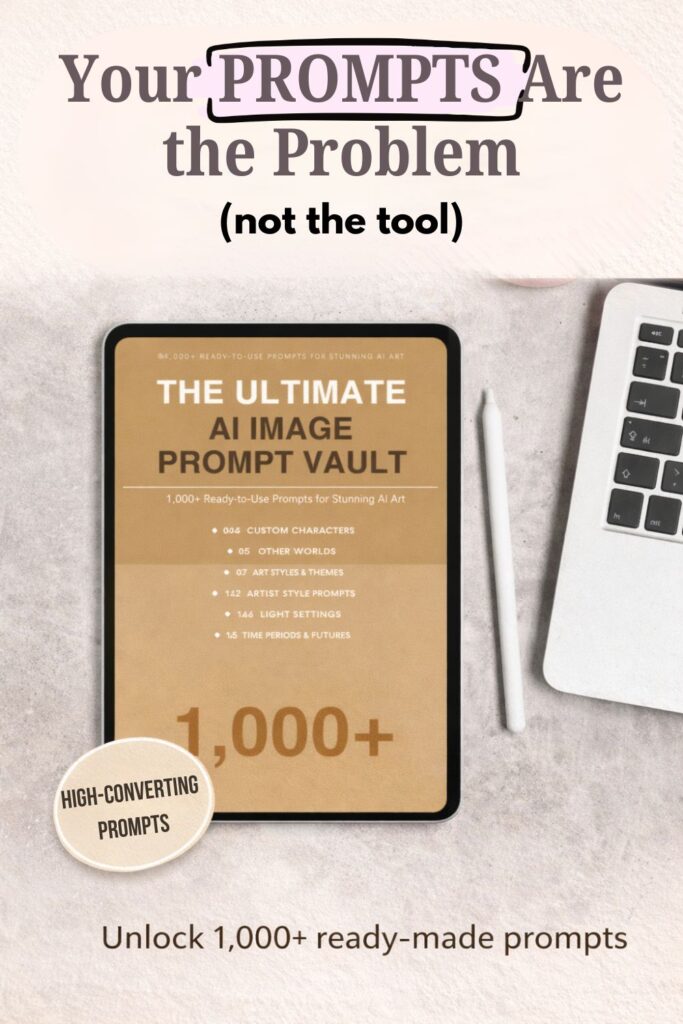
If you are not one of those people, that is what the vault is for.
Over 1,000 done-for-you prompts, already structured and categorized, covering characters, aesthetics, lighting setups, art styles, environments, and more than you would realistically sit down and figure out on your own. You open it, copy what fits, paste it in, adjust if needed, and move on.
That is it. No guesswork. No starting from scratch every time.
One last thing worth saying: the difference between an image that scrolls past and one that stops someone in their tracks is not talent or luck. It is instruction. Once you start thinking like a director instead of someone filling in a search bar, the results change completely.
Your images will stop looking basic. That part I can promise.


")

No Comment! Be the first one.